ReviewsBlogContact
Start Your Project

Did you know that 93% of consumers place visual appearance and colour above other factors when making a purchasing decision? This statistic underscores the paramount importance of choosing the right colour palette for your website. As you embark on the journey of web design, understanding the psychology behind colours and how they influence user behaviour is crucial. From evoking emotions to reinforcing brand identity, the colours you select have the power to connect with your audience on a subconscious level. But how do you navigate the vast spectrum of possibilities to find the perfect blend for your site? Let's explore the science and strategy behind making informed colour choices that resonate with your users and enhance their experience.
Key Takeaways
To grasp colour psychology, it's essential to recognise how different colours can profoundly influence our emotions and decisions. When you're browsing websites, it's not just the content that affects you. The colours you see play a massive part in how you perceive the information, whether you're conscious of it or not. For instance, blue often instils a sense of trust and security, making it a favourite for banking and technology sites. On the other hand, red can evoke feelings of excitement or urgency, which is why it's commonly used for clearance sales.
You're also likely to react differently to a website based on its colour scheme. A site that uses soft, pastel colours might make you feel calm and relaxed, perfect for health and wellness sites. Conversely, a website with bright, bold colours could energise you, which is ideal for sports or entertainment platforms. Understanding these subtle cues can significantly affect your online experience, guiding your interactions and responses without you even realizing it. So, as you navigate through various websites, remember, that the colours aren't just there to look pretty; they're strategically chosen to influence your reaction.
Delving into the science behind colours reveals why certain hues trigger specific emotional and psychological responses in you. At its core, the science is rooted in how your brain perceives light. When light hits an object, some wavelengths are absorbed while others are reflected. The reflected light enters your eyes and is interpreted by your brain, which then perceives the colour. This process is more than just mechanical; it's deeply connected to the psychological and physiological workings of your brain.
Different wavelengths are associated with different colours. For example, longer wavelengths are perceived as reds, while shorter wavelengths are seen as blues. This difference in wavelength impacts how you perceive and interact with different colours. Your reaction isn't just personal; it's a complex interplay of biology, cultural conditioning, and individual experiences.
Moreover, colours can influence your brain's chemistry. They can affect your mood, attention span, and even physical reactions like heart rate. While the full extent of these effects is still being studied, it's clear that your brain's response to colour is both immediate and impactful, shaping your interaction with the world in subtle, but powerful ways.
Colours profoundly impact your emotions, often evoking a wide array of feelings without you even realising it. When designing a website, understanding this emotional impact is crucial. It's not just about aesthetics; it's about creating an experience that resonates with your audience on a deeper level. Here are three essential ways colours influence emotions:
Incorporating these insights into the web design process can significantly affect how users perceive and interact with your site. It's not just about colour; it's about creating an emotionally resonant experience that aligns with your brand's identity and values.
Understanding the importance of colour schemes can significantly influence how visitors perceive and interact with your website. It's not just about picking your favourite colours; it's about creating a cohesive and compelling visual experience that aligns with your site's purpose and audience's expectations. When you choose your colour scheme wisely, you're not only enhancing the aesthetic appeal of your site but also boosting its usability and user engagement.
Here are three key reasons why colour schemes are crucial in web design:
Selecting the right colours for your brand identity is crucial in establishing a memorable presence in the digital landscape. The colours you choose speak volumes about your brand's personality and values. They're not just about aesthetics; they're about communicating your brand's essence to your audience. When you're picking colours, think about what you want your brand to represent. Do you want to convey trust and dependability? Blue might be your go-to. Looking to express creativity and energy? Orange could be more your speed. It's all about matching your brand's core values with the right colour psychology
Don't overlook the importance of consistency. Once you've selected your colours, use them consistently across all your platforms. This consistency helps in building a strong brand identity that's easily recognisable. Your audience will start associating those specific colours with your brand, enhancing brand recall. Additionally, maintaining this uniformity across your website, social media, and marketing materials reinforces trust and professionalism. Whether you're updating your e-commerce store or undergoing a full WooCommerce rebranding to Woo, integrating your chosen colour palette seamlessly will ensure a cohesive and polished appearance. This level of attention to detail can make a lasting impression and set your brand apart in a crowded marketplace.
After choosing your brand's colours, it's crucial to consider colour contrast for accessibility, ensuring everyone can easily interact with your content. Good contrast isn't just about aesthetics; it's about making your website usable for people with visual impairments, including those who are colour-blind or have low vision. You're not just designing for style but for inclusivity.
To nail colour contrast for accessibility, follow these guidelines:
Trends In Colour & Web Design
Exploring the latest trends in colour and web design can significantly enhance your website's appeal and user engagement. As you dive into this dynamic world, you'll notice that bold and vibrant colours are making a strong comeback. They're not just there to grab attention; they're about creating an immersive experience that resonates emotionally with visitors.
You've likely observed the rise of dark mode, too. This isn't just a trend for the sake of aesthetics; it's about improving readability and reducing eye strain, especially in low-light conditions. Integrating this feature can show your commitment to user comfort and accessibility.
Gradient backgrounds are another trend you can't miss. They add depth and texture to your site, moving away from flat, monochromatic schemes. When used thoughtfully, gradients can guide visitors' eyes towards key content or calls to action without overwhelming them.
Minimalism continues to hold its ground, emphasising clean lines, ample white space, and restrained colour palettes. This approach isn't about being dull; it's about enhancing usability and ensuring that your content shines without unnecessary distractions.
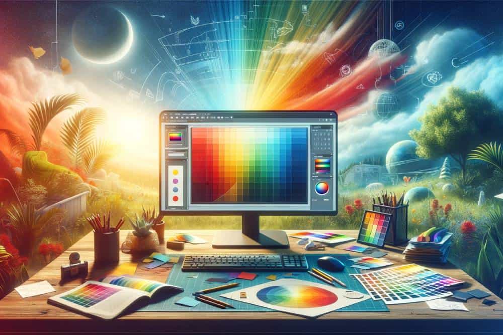
Choosing the right colours for your website's palette can dramatically influence your visitors' experience and interaction with your site. Once you've selected your colours, it's time to implement them effectively. Here's how you can do that:
Once you've implemented your colour palette, it's crucial to analyse and test your choices to ensure they're achieving the desired effect on your audience. Start by collecting user feedback through surveys or interviews. You'll want to focus on how the colours make your visitors feel and whether those emotions align with your brand's message. It's also a good idea to track user behaviour on your site. Are certain colours boosting engagement or perhaps causing users to bounce? Tools like heatmaps can show you how different elements of your design are performing.
Don't overlook A/B testing. This involves creating two versions of your site, each with a different colour scheme, and then seeing which one performs better. This method can provide concrete data on which colours resonate more with your audience.
Now that you've delved into the psychology of colours and their impact on web design, you're equipped to choose your palette wisely. Remember, it's not just about picking colours you like; it's about what those colours convey to your audience. Ensure your colour choices enhance accessibility, align with current trends, and resonate emotionally. Test your palette to see how it performs in real-world scenarios.