ReviewsBlogContact
Start Your Project

The following article contains all the guidelines you will need to meet Amazon's content specification requirements for your storefront creation. A store page contains customisable sections of tiles. Each tile can include content such as text, images, videos and products.
Every Store page has a header section built in and needs to have at least one additional content tile. Each page can have up to 20 sections total, which can consist of a maximum of:
If you reach the limit of one of these tile types, you won’t be able to add another unless you delete an existing tile of that type. Alternatively, you can change the content in any existing tile of that type.
Split sections contain multiple tiles that can be arranged into a variety of layouts.
Single-row split sections are variable in height. To configure the height, click on the gear icon and use the height adjustment control.
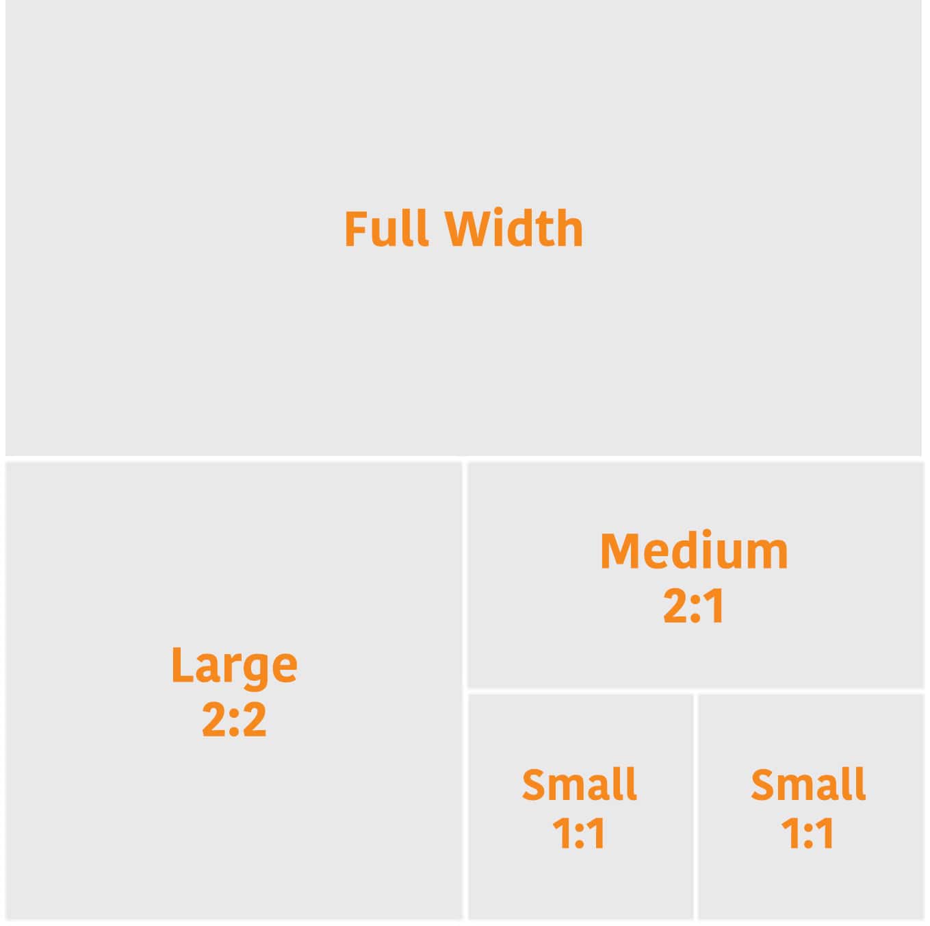
There are two categories of tiles in Stores: basic tiles and variable-height tiles.
Basic tiles are locked to a specific aspect ratio. There are four basic tile sizes: full width, large, medium and small.
| Tile type | Full width | Large | Medium | Small |
| Text | Yes | Yes | Yes | Yes |
| Image | Yes | Yes | Yes | Yes |
| Image with text | Yes | Yes | Yes | Yes |
| Shoppable image | Yes | Yes | Yes | Yes |
| Video | Yes | Yes | Yes | No |
| Background video | Yes | Yes | Yes | No |
| Gallery | Yes | No | No | No |
| Product | Yes | Yes | Yes | Yes |
| Product grid | Yes | No | No | No |
| Best sellers | Yes | No | No | No |
| Recommended products | Yes | No | No | No |
| Featured deals | Yes | No | No | No |
Variable-height tiles allow the aspect ratio of the tile to change, depending on the height of the content. Image and text tiles support variable height.
The header appears at the top of your Store and includes a hero image, brand logo and navigation bar.
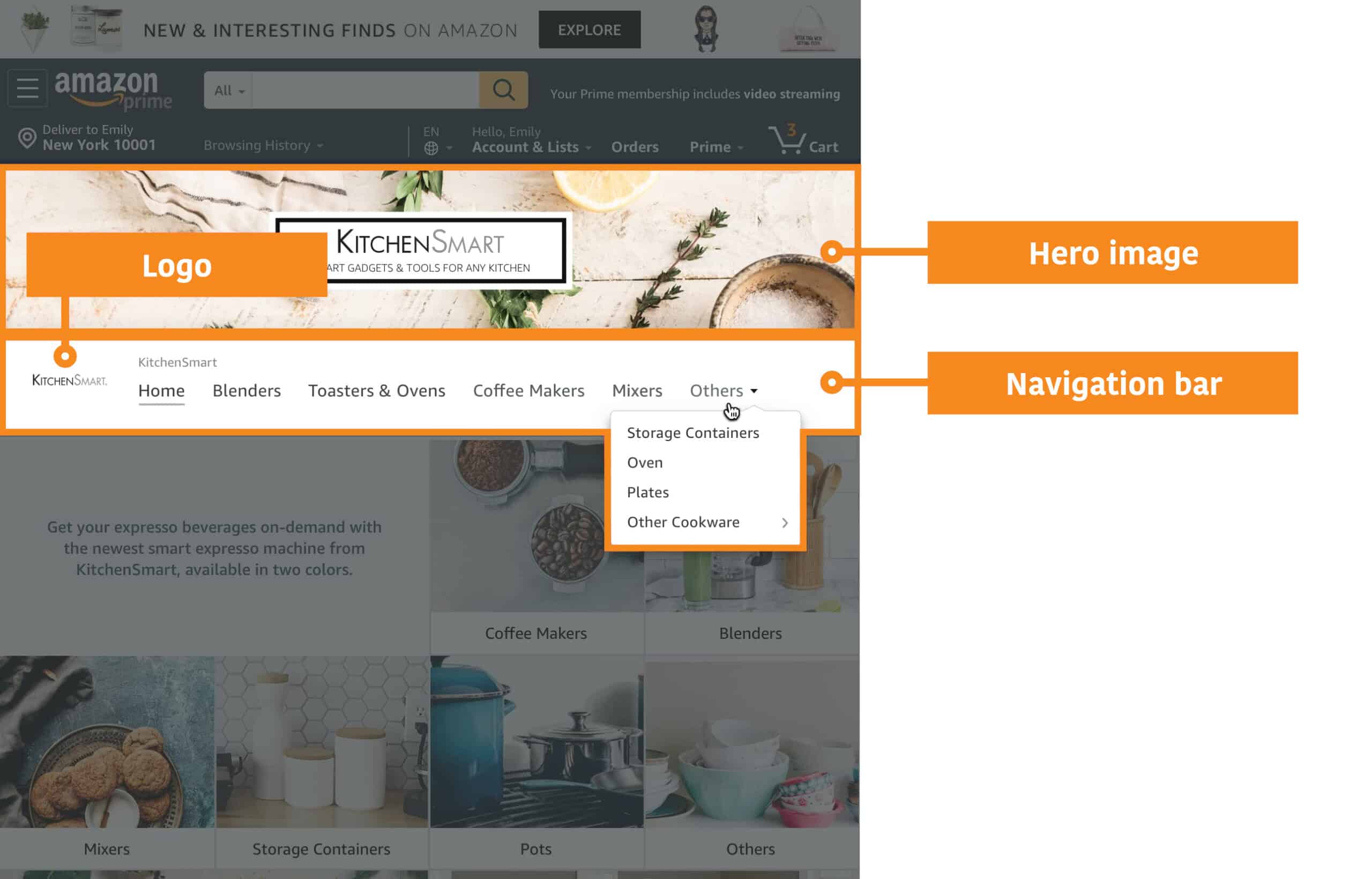
The hero image appears at the top of every page in your Store, above the navigation bar and helps to separate your Store’s navigation and content from Amazon’s.
We recommend carefully selecting your hero image on each page, as these images are the first thing that shoppers will see when they arrive on your Store. This visual greeting can help make a lasting impression.
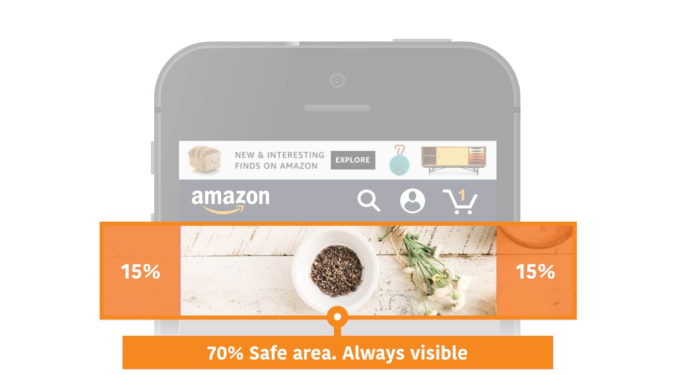
Safe zones for hero images
To ensure that your hero image looks great on any device, Amazon require a safe zone, which is an area in the centre of your image that will always be visible. This safe zone is crucial because it prevents important elements, such as text or key visuals, from being cropped or obscured when viewed on different screen sizes. By keeping critical details within this area, you ensure a consistent and professional appearance across all devices. Following these Amazon product image tips will help highlight your product effectively while maintaining a polished and customer-friendly design.
The navigation bar appears underneath the hero image and contains links to every page in your Store, beginning with your Store homepage.
The brand logo acts as a home button and is displayed on all pages in the navigation.
| Header element | Min. image size | Max. file size |
| Hero image | 3,000 × 600 px | 5 MB |
| Brand logo | 400 × 400 px | 5 MB |
Text tiles contain freeform text and can link to a Store page or detail page.
Text can be positioned to the left, right, in the centre or justified.
Image tiles can link to a Store page or product detail page.
Adding a link title to an image tile will cover some of the image.
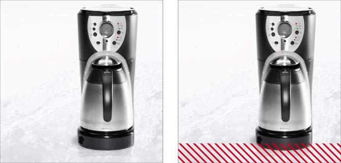
For rectangle images (medium and full-width tiles) with link titles, about 19% of the image will be obscured at the bottom.
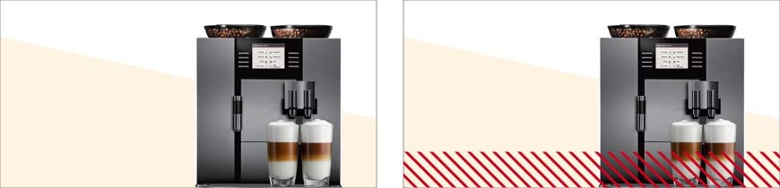
For square images (small and large tiles) with link titles, about 12% of the image will be obscured at the bottom
All image tiles allow you to optionally use a custom image and layout for mobile devices.
Uploading images with embedded text is not encouraged. The text will not be readable by search engines or by people who rely on screen readers to navigate your Store. To add text to images, use the “Image with text” tile option.
| Tile size | Max. file size | Min. image size (desktop) | Min. image size (custom mobile) |
| Full width | 5 MB | 1,500 × 20 px* | 1,680 × 20 px* |
| Large | 5 MB | 1,500 × 1,500 px | 1,680 × 20 px* |
| Medium | 5 MB | 1,500 × 750 px | 1,680 × 20 px* |
| Small | 5 MB | 750 × 750 px | 750 × 750 px |
* For a high-resolution display on all devices, an image width of 3,000 px is recommended. If a title is added to the image tile, the image height must be at least 32 px.
The image with text tile has two layout options:
This layout lets you overlay text directly onto an image. It includes the ability to:
This layout lets you add text beside an image. It includes a header and description text.
| Layout | Tile size | Min. image size |
| Text over image | Full width | 3,000 × 1,500 px |
| Text over image | Large | 1,500 × 1,500 px |
| Text over image | Medium | 1,500 × 750 px |
| Text over image | Small | 750 × 750 px |
| Text next to image | Full width | 1,500 × 1,500 px |
| Text next to image | Large | 1,500 × 1,500 px |
| Text next to image | Medium | 750 × 750 px |
| Text next to image | Small | 750 × 750 px |
Shoppable images showcase up to six products with interactive points. Shoppers can interact with the points to see key information and continue to purchase.
| Tile size | Max. file size | Min. image size |
| Full width | 5 MB | 1,500 × 750 px* |
| Large | 5 MB | 1,500 × 1,500 px |
| Medium | 5 MB | 1,500 × 750 px |
| Small | 5 MB | 750 × 750 px |
* For a high-resolution display on all devices, an image width of 3,000 px and height of 1,500 px is recommended.
Video tiles are shown in a player that shoppers can click to play. The shopper can play and pause the video, control the volume and view the video full screen.
| Tile size | Min. cover image size | Min. video resolution | Min. to max. aspect ratio | File requirements |
| Full width | 3,000 × 1,500 px | 1,280 × 640 px | 6:4 to 8:3 | MP4 file format. H.264 video codec. |
| Large | 1,500 × 1,500 px | 640 × 640 px | 3:4 to 4:3 | MP4 file format. H.264 video codec. |
| Medium | 1,500 × 750 px | 450 × 320 px | 6:4 to 8:3 | MP4 file format. H.264 video codec. |
Background videos auto-play and auto-replay on silent while visible within the screen. They play inline on desktop and mobile.
| Tile size | Min. video resolution | Max. height | Min. video length | Min. to max. aspect ratio | File requirements |
| Full width | 1,280 × 640 px | 1,500 px | 2 to 20 seconds | 6:4 to 8:3 | MP4 file format. H.264 video codec. |
| Large | 1,280 × 640 px | 640 px | 2 to 20 seconds | 3:4 to 8:3 | MP4 file format. H.264 video codec. |
| Medium | 1,280 × 640 px | 320 px | 2 to 20 seconds | 6:4 to 8:3 | MP4 file format. H.264 video codec. |
The gallery section shows up to eight images in a full-width grid layout.
| Min. image size |
| 1,500 × 750 px |
When used with split sections, product tiles highlight a single product, show price and Prime status, and link to a product detail page.
Medium tiles can include a custom product title and description. Full-width product tiles have two layout options:
| Layout | Tile size | Title | Description |
| Product detail | Full width | Pulls from detail page | Pulls from detail page |
| Product editorial | Full width | Custom | Custom |
| Product with text | Medium | Custom | Custom |
The product grid shows four or more products in a full-width grid layout.
The list of products can be added:
There are two types of product grid layout options: standard and tall.
Products are shown in a square grid. This style works for product categories that use square or wide rectangular images.
An “Add to basket” button lets shoppers add items to their Amazon basket directly from your Store. The button won’t show if the product:
Products are shown in a tall grid. This style works for product categories that use tall vertical images, such as in fashion categories.
The “Add to basket” button is hidden for all products in the tall grid.
The best seller tile shows the top-selling products associated with your brand. It automatically shows five products at a time.
This tile can only be selected if your Store is associated with your brand’s products in the catalogue. The tile won’t be shown if there are no best seller products. If you don’t see this tile in the Store builder, contact Amazon support.
The recommended products tile shows products associated with your brand that are recommended to a shopper based on previous shopping history. It automatically shows five products at a time.
This tile can only be selected if your Store is associated with your brand’s products in the catalogue. The tile won’t be shown if there are no recommended products. If you don’t see this tile in the Store builder, contact Amazon support.
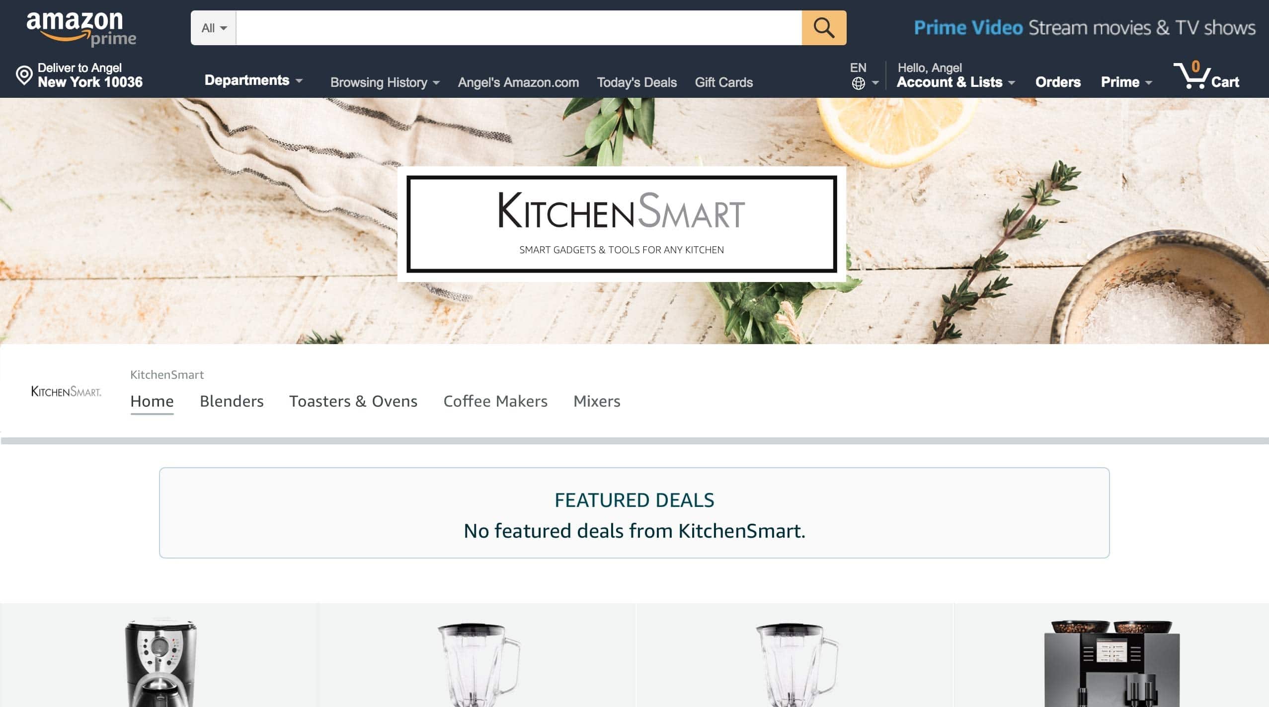
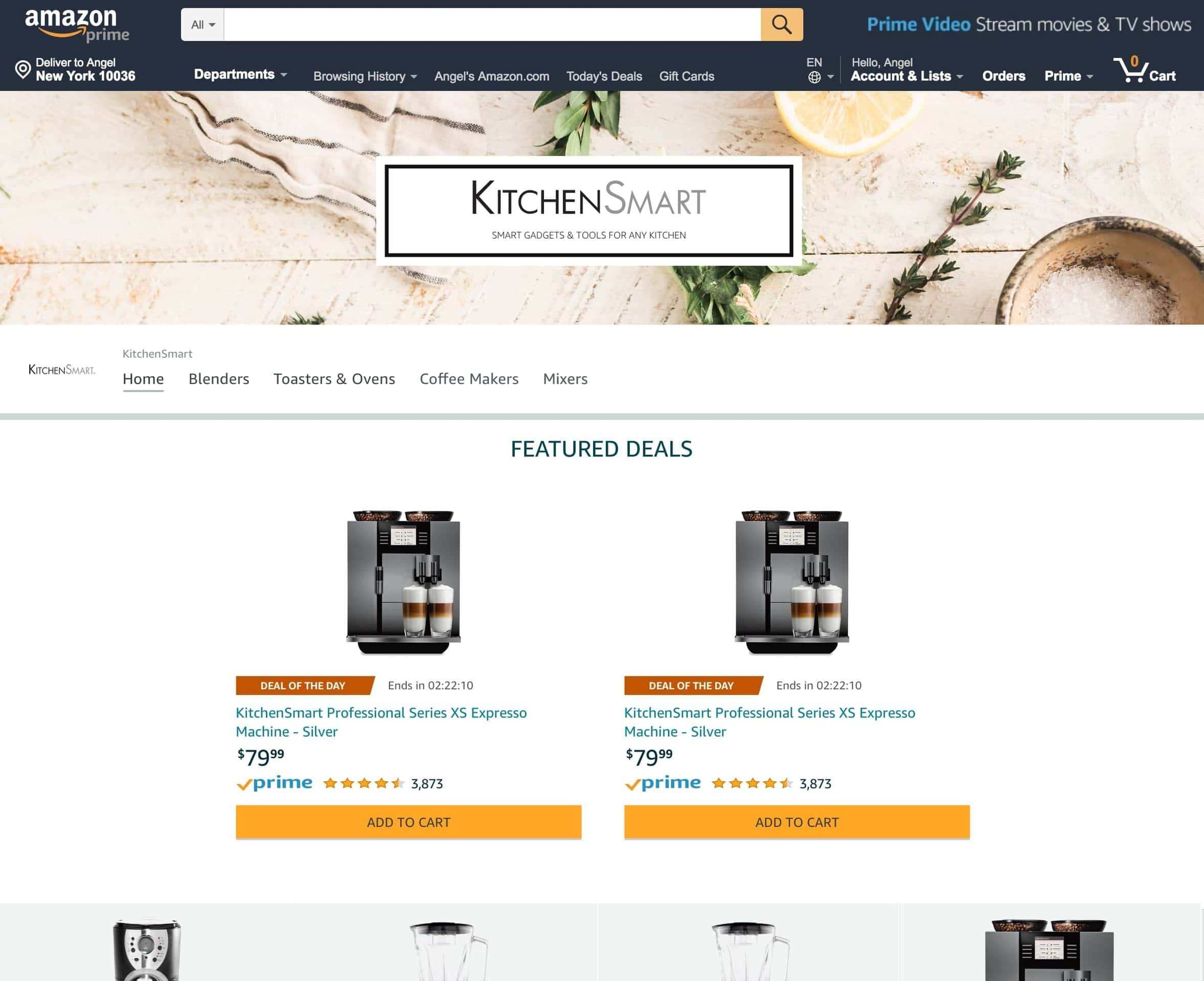
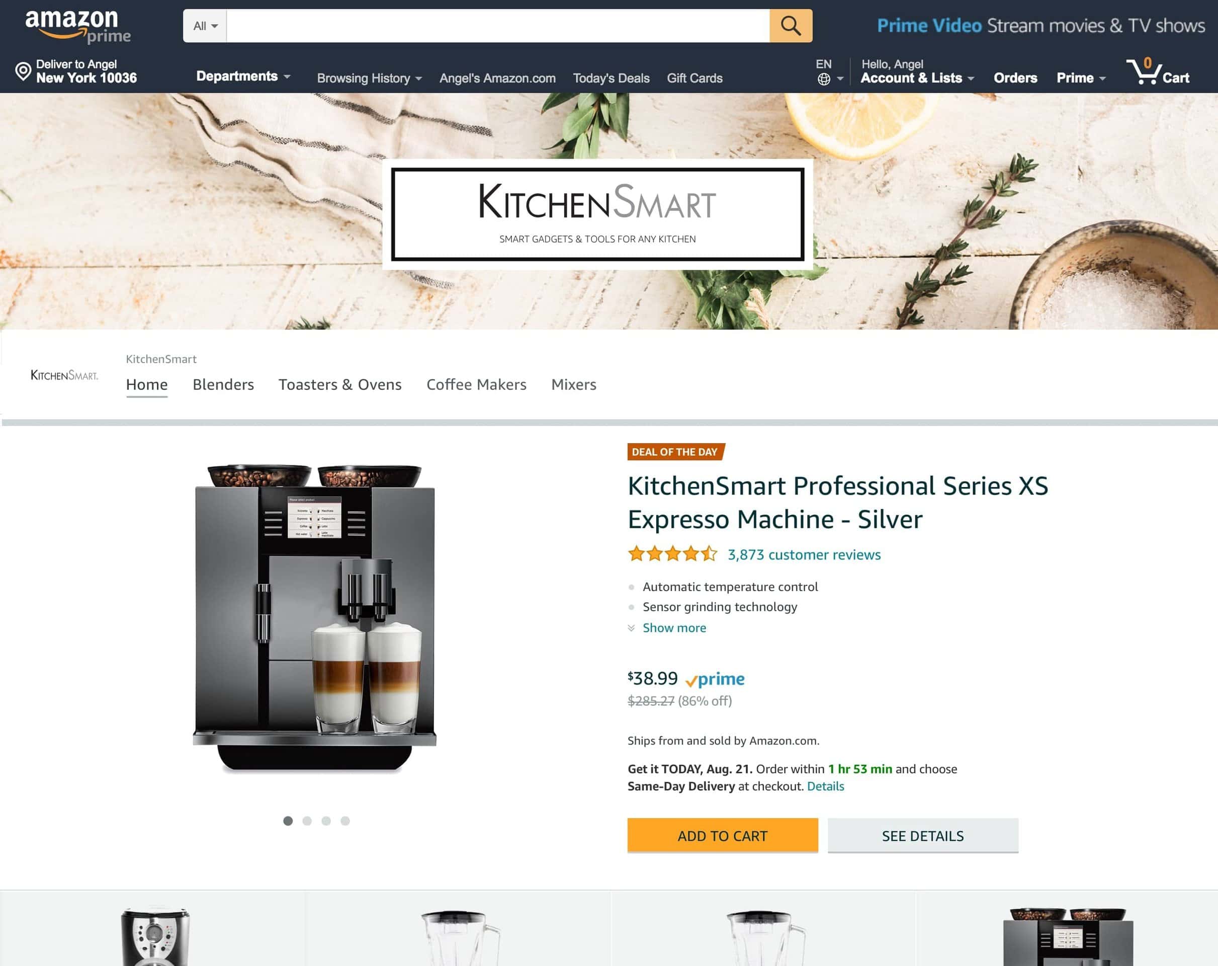
The featured deals tile shows products with active promotions. The products will automatically appear in the tile for as long as the promotions last. When a promotion ends, products associated with the promotion will no longer appear in the tile.
Promotions that show in the tile include Best Deal, Deal of the Day and Limited-time Deal. Voucher-based promotions won’t appear. You can choose for the tile to feature:
Here’s how the tile will look to shoppers when you have active promotions on:
Your products will appear in a full-width, four-column grid section underneath the “featured deals” title (see below for example of two products).
Your products will appear in a centre-aligned section underneath the “featured deals” title (example of two products shown below).
Your single product will appear in a full-width section, without the “featured deals” title.
A banner will appear to let shoppers know that there aren’t currently featured deals.